
Bound by Interests, Connected by Moments
Background
The Problem
Technology can be leveraged to facilitate social interactions for people who may have difficulty meeting new people and establishing meaningful connections.
In an era where everyone is living online, it becomes difficult to meet new people and have meaningful social interactions with other like-minded individuals.
I wanted to develop an application that will help facilitate these types of social interactions and events in hopes that people are able to meet others to make long lasting memories.

Project Type: End-to-End Application
Role: UX/UI Designer
Tools: Figma, FigJam, Zoom
Duration: 100 Hours
Barrier to Entry: As individuals age, opportunities to meet new people diminish, making it harder to forge meaningful connections.
Technological Advancement: While technology connects us virtually, it often promotes a lifestyle of isolation, reducing real-life interactions.
Market Scarcity: Existing platforms primarily focus on romantic connections, leaving a gap for those seeking platonic relationships.
Project Goals
Meet Like-Minded Individuals: Enable users to form genuine, interest-based friendships, enhancing their social experiences.
Balance Social Interaction w/ Personal Comfort: Develop a platform that respects varying comfort levels in social interactions, catering to diverse personalities and interests.
Discover New, Local Events: EAllow users to explore activities and events tailored to their interests and locations, which they might not find independently.
The Design Process
Empathize
→
Define
→
Ideate
→
Prototype
→
Test
01 Empathize - Uncovering Needs and Pain Points
Competitive Analysis
The research phase started off with analyzing both direct and indirect competitors such as Meetup, Hinge, Bumble, and Tinder. I wanted to understand the current strengths and weaknesses of each respective company to identify where LÜM can offer a solution to the problems that the competitors can’t.

Strengths:
Offers a diverse range of events and groups that would appeal to wide demographic
Offers hybrid event options for people that may want to meet virtually as opposed to in person
Weaknesses:
High organizer fees discourage people from organizing events
Reported that the algorithm and UI seems to be outdated
There is a lack features that facilitate communication between the members within a group
Strengths:
Engaging UI as users able able to react to both photos and prompts which further facilitates meaningful conversations
Offers personalized matching systems as users can filter based on criteria's such as lifestyle habits or political views
Weaknesses:
Costs of the premium versions are relatively expensive
Complaints regarding the algorithm with irrelevant suggestions and repetitive matches

Strengths:
Offers Bumble BFF for people to establish platonic friendships and Bumble Bizz for networking opportunities
Bumble BFF emphasizes user safety through photo verification and encourages reporting of inappropriate behavior
Offers innovative features like video chats and and safety tools
Weaknesses:
A high customer acquisition cost
Scrutiny over data protection and privacy

Strengths:
Established global brand recognition
In app purchases and subscriptions lead to Tinder being the highest grossing non-gaming application
Has campaigns with other popular social media apps to maintain engagement
Weaknesses:
There is a gender imbalance within its user demographic which affects user retention for some users
High concentration of bot accounts which deter user retention
User Interviews
Insights
Excluding Meetup, the existing competitors focus solely on romantic relationships. Meetup offers a solution to allow users to connect with each other based on shared interests; however, the events are hosted by other users that have to pay higher organizer fees which may serve as a deterrent for users to host events.
The competitor analysis helped me form the hypotheses that I wanted to confirm during user interviews:
There is an appeal to using an application to meet other like minded individuals to form platonic relationships given the difficulty of make friends as people grow older
The spontaneity of meeting random people and going to a curated event based on similar interest is appealing
I conducted one-on-one interviews with 5 participants (3 M : 2 F) who have varying personality types (outgoing vs cautious) and interests. The primary objective was to understand the challenges people face when trying to meet new people to form social connections, and identify technological features that will effectively help potential users form meaningful connections with like-minded individuals.
Key Questions
What do you look for when trying to make friends and establishing new relationships?
Describe a time when you wanted to make new friends (after graduating college). What steps did you take and what difficulties did you face?
Do you currently use any technology or applications to meet new people? If so, please describe your experience, both positive and negative.
Does the spontaneity of meeting random people and going to a random event based on similar interests sound appealing to you? Why or why not?
What did I discover?
Pain Points for Social Connections
There is a lack of opportunity to meet people to form connections after graduating college
Increased difficulty of planning events due to scheduling conflicts and distance
There is a lack of variety in social events to attend
Wants
Participants likes the ability to set preferences for potential matches on current online platforms to meet others
Similar interests are one of the main things that participants look for when trying to form meaningful connections
Needs
Participants are willing to meet strangers with similar interests for local events but would need a vetting process
Safety is a primary concern (account verification, ability to bring friends, extensive profile information)
02 Define - Analyzing Insights to Articulate a Focused Problem
User Persona
Using the insights gathered from user interviews, I created two user personas to accurately reflect the varying personality types of the potential users (outgoing vs reserved). There was a clear difference in preferences and pain points based on personality type and gender.
Alex is an outgoing bachelor who moved to a new city and wants to expand his network.
Emily is a college student that want to meet others with similar interest while prioritizing her comfort and safety.


Problem Statements
I’d like a safe and easy way to meet new people with similar interests because it’s been hard to establish meaningful relationships since graduating college given the lack of opportunities to meet like minded individuals.
How might we design a simple interface that accurately matches users with other people that genuinely have similar interests and curate events that they would enjoy together?
I’d like my safety to be a top priority when meeting the people that I matched with because it may potentially be dangerous to meet with random strangers that I meet online.
How might we ensure that strong safety measures are taken so that users feel as if their personal information remains private, feel safe and comfortable when meeting their matches, and have control over who/when they meet.
I’d like to make sure that coordinating events with my matches are simple and pain free because I don’t have the time to put too much effort in planning given my busy schedule.
How might we make event planning and scheduling seamless within the app so users can easily coordinate and manage logistics for curated events?
03 Ideate - Generating a Variety of Creative Solutions
Feature Roadmap
The ideation phase began with creating a feature roadmap to help organize my thoughts and identify the features required to meet the users needs. I thought of every possible feature that would be included into the application and prioritized them based on the importance and feasibility given the constraints. The features were derived from user interviews, competitive analysis and secondary research. By identifying the “must-have” features, I was one step closer to understanding what I would need to design in the prototype phase.
The “Must-Have” features helped me identify what key screens I would need to start designing when creating my low-fidelity wireframes:
Interest Form/Questionnaire: Would serve as the primary data used to match users with others that have similar interest and required in order to create a user profile
In-App Event Planning & Scheduling/Messaging & Communication: Users would need to be able to communicate with each other to plan the events within the application rather than relying on other external forms of communication
Personalized User Profile/Privacy & Safety Controls: Gives the users control of their own data and what they want displayed for other users to see

User Flow
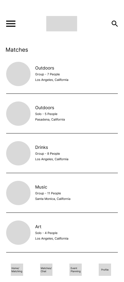
One of the key insights gathered from creating a sitemap is the fact I knew I needed to separate matches and confirmed events. I wanted to give users the flexibility to choose if they would actually like to meet with their matches and felt it would be better to keep the pending matches in one page and the confirmed events in another so there wouldn’t be any confusion.

Sitemap
With the sitemap established, I proceeded to create a user flow for the primary function of the application: Meeting a match to attend a curated event
One of the key insights I gathered from the user flow was that users would need to conduct a group vote to confirm if they would like to meet for the event. Users would be able to communicate and vet each other in the group chat and collectively decide on if they would like to proceed with the event.
I also determined the matches would be based on the “event type” so that the matching between the users and actual specific event remains spontaneous but related to the general shared interest.

04 Prototype - Let’s Start Designing
Low/Mid Fidelity Wireframes


I started the prototype phase by designing low/mid fidelity wireframes of the user sign up page which included general user information and their interests. Because users would submit their matches based on “event type”, the interest form would serve to curate a tailored home page of events that would align with the user’s interests.
The home page lists general categories of events that users would be able to choose from. Once selected, users are able to specify their preferences and the algorithm would match them with other users that also submitted similar preferences for the same category of event.
Once matched, users would be able to communicate with each other and determine if they would like to proceed with the event. Designing the low/mid fidelity wireframes helped me realize that there would need to be two separate pages for “matches” and “events” as the separate pages would help users differentiate between their matches and events that have already been confirmed. The primary struggle I had at this point was trying to think of a way to design the “matches” and “events” page distinctly so users would know the different function of each.


Sign Up/Interest Form
Matches/Chat
Branding
High-Fidelity Wireframes
Sign Up/ Interest Form
Events
Events/Chat
Home/Match Submission
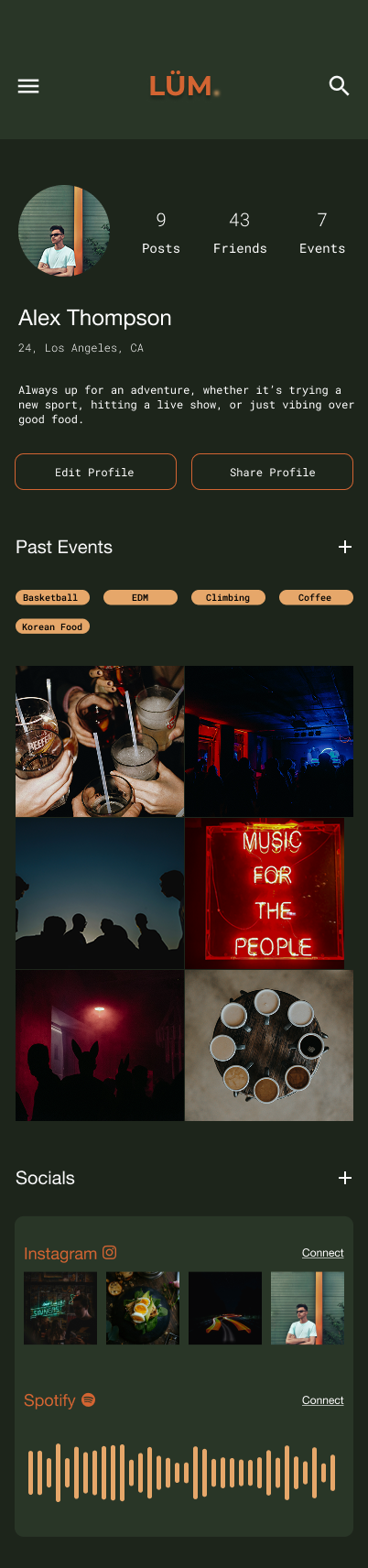
Profile
Mood board
The primary appeal of LÜM was the spontaneity of the unknown. Users would match with people they don’t know to go to an event that they may have never been before to create memories that would have previously never existed if it wasn’t for LÜM. I always envisioned the overall mood to feel cinematic and ethereal. I wanted users to feel as if the events they attended felt like something out of a movie. Although users wouldn’t know what specific event they’re going to and who they are going with, the event would still be based on their interest - I wanted to capture that excitement and familiarity.

UI Library
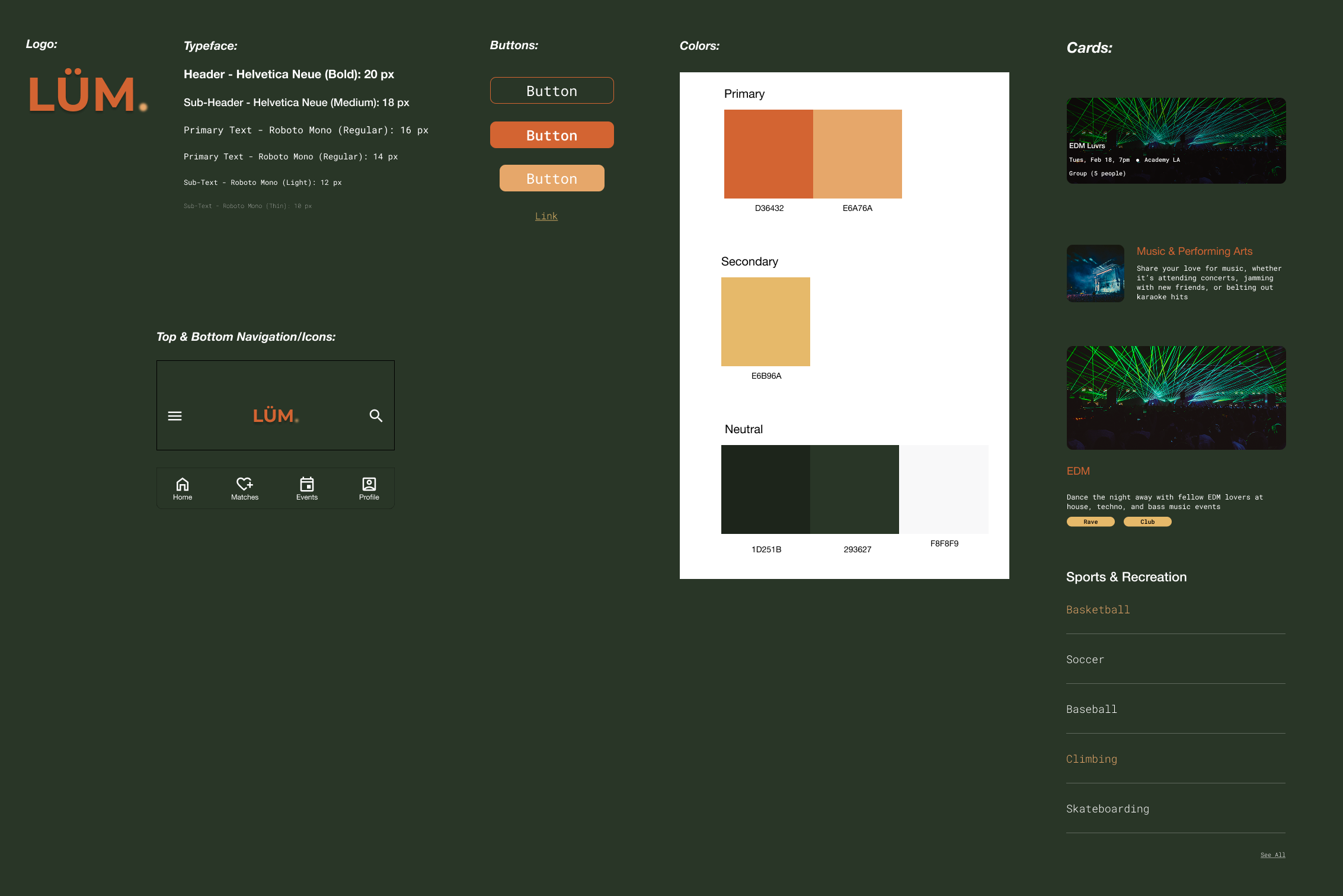
Logo:
I created a typeface logo design with a play on the word “Loom”. A loom is a device used to weave cloth and tapestry together, and I felt like it perfectly described what the application is trying to accomplish. I wanted to weave people together on the basis of similar interests to create a connection that otherwise would have never formed if it wasn’t for the application. I decided to change the variation of the name given the fact that “Loom” is already an established video communication software. I drew inspiration from the brand Stüssy when figuring out how I wanted to create a variation of Loom. I added a blurred period at the end to represent the “blurry nights” I hope the users experience after attending a curated event.
Color Palette:
As I was looking at my mood board, I was reminded of the movie “Fallen Angels” directed by Wan Kar-Wai. I was particularly drawn to the overall mood evoked when watching movies directed by Wan Kar-Wai; it felt melancholic, dream-like, and wistful. Wan Kar-Wai’s use of the color green helped evoke these types of emotions in “Fallen Angels” and I wanted to use the a similar deep variation of green.
The primary color I chose appealed to me because of its quiet intensity. There’s was a lurking intensity in the color. It’s the green of something just out of sight — slightly secretive, intimate, and emotionally rich without being loud.
The secondary color feels like the color of a memory you don’t want to forget — bold, but deeply human. It feels passionate, energetic, and alive, like the final flare of a sunset or the glow of an old neon sign.
Mixing the primary and secondary felt like a perfect juxtaposition that evokes the cinematic mood I felt when looking at my mood board.
Typeface:
Helvetica Neue is used for the header due to it felt both contemporary and timeless while Roboto Mono was used for the primary text for its focused and futuristic undertones.
With branding established, I created my first iteration of high fidelity wireframes and a prototype that would be used during usability testing. I created mobile screens only as I knew my target audience is Millennials and Gen Z who tend to use mobile over desktop.


Matches/Chat/Group Vote
Sign Up/ Interest Form
Profile
05 Test - Usability Testing and Iterations
Usability Testing
Iterations
Methodology
One-on-one moderated usability testing with 5 participants (3 M : 2 F) conducted in-person with an interactive Figma prototype.
Goals
Understand the overall usability of the high fidelity prototypes
Get feedback from users regarding overall visual design and identify areas for improvement
Identify the major pain points that users may experience when attempting to complete a task
Confirm if the users are able to understand how to successfully confirm an event with their matches
Optimize the format for potential match submission based off user feedback
Ability for users to understand the difference and relationship between the “Matches” and “Events” page
Tasks
Sign up for a profile and submit a potential match for an event
Once matched for an event, participate in a group vote to confirm the event
Review confirmed event information and cancel an event that was already confirmed
Key Insights
Extra Safety Measures
Participants pointed out that there were minimal safety measures when signing up for a profile
Visual Distinctions
Although the functional difference between the “Matches” and “Events” page were understood, they were too visually similar
Profile
Participants advised that there should be more information listed on user profile page
Match Submission
Participants pointed out additional information that could be included when submitting for a potential event match
Opportunities:
Completely redesigned the “Events” page to make it more distinct from “Matches” page
Redesigned the profile page for better information architecture and overall design
Added identity verification for profile sign up
Added additional preferences for Match Submission (gender, price, and age preferences)
Labelled bottom navigation icons
Designed confirmation pages after submissions/votes so users can undo as needed
Added different shades of primary colors to make design less bland
Omitted “Event Type” to allow users to bring their friends as needed
Completely redesigned the “Events” page to make it more distinct from “Matches” page


Redesigned the profile page for better information architecture and overall design

Before
After
Before
After

Next Steps
Takeaways
Final Results


Partnership with Local Vendors
Partner with local vendors to create exclusive events that help with marketing and brand recognition
Individual Connections
Design a way for users to communicate with other users on a 1 on 1 basis rather than group communication only
Monetization
In-app purchases, subscription models, gamification, and secure payment gateways for paid events
General Insights
In social applications that involve meeting strangers online, it’s extremely important to account for different demographic of people and their differing priorities (safety, price, location).
Challenges
One of the primary challenges was figuring out a way to effectively design a way for users to match with others while maintaining the appeal of spontaneity and keeping safety as a priority.
What Did I Learn?
Not to be married to my ideas just because they are mine. The insights gathered from usability testing positively impacted the overall design despite my initial reluctancy or disagreements with some feedback.
What Would I Have Done Differently?
Although I tried to account for a wide demographic for user interviews (gender and personality type), I would have included a wider variety of age rather than focusing on young adults only.